Simplifying Tractor In-Cab Displays
Redesigning John Deere's complex tractor interface to reduce cognitive load for farmers, improving efficiency in agricultural operations through intuitive design and streamlined workflows.
The Challenge
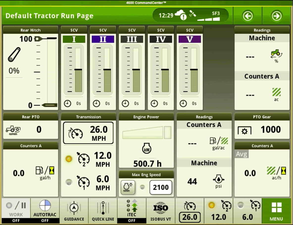
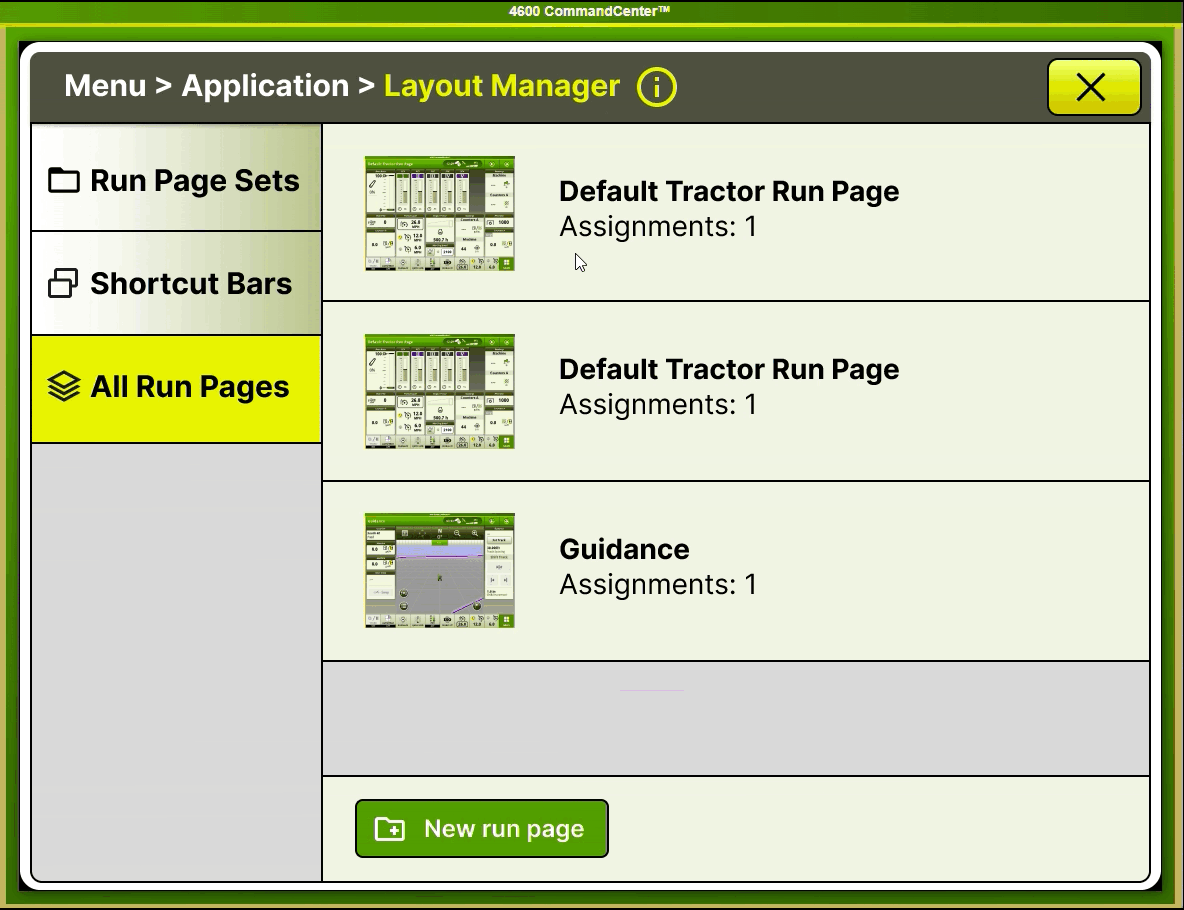
John Deere's tractor operators were struggling with overly complex in-cab displays that hindered productivity during critical farming operations. The Layout Manager was significantly underutilized, and the Help Center failed to provide adequate user support, leading to operational inefficiencies and user frustration.
Research Methodology
Comprehensive User Research Approach
We collaborated directly with John Deere's UX team to understand existing pain points, then conducted comprehensive user research with farmers at Iowa State University to validate issues and uncover additional insights.
Stakeholder Interviews
Met with John Deere UX lead to understand current system limitations and business constraints
User Interviews
Conducted 5 interviews with farmers ranging from novice to expert levels
Task Analysis
Analyzed 3 critical user tasks to identify workflow bottlenecks
Usability Testing
Tested current vs. proposed designs with quantitative analysis
Key Research Findings
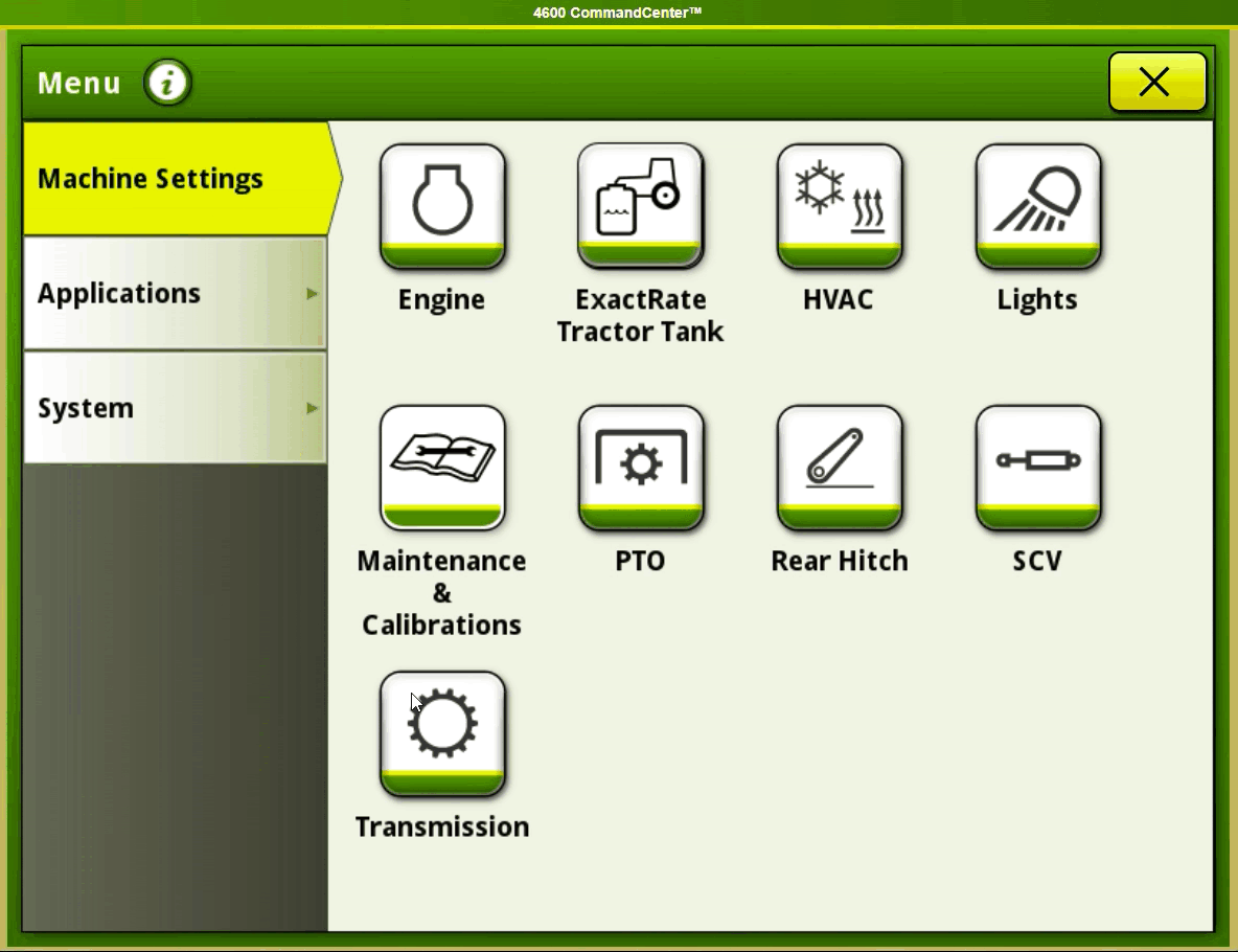
Complex Customization
Users struggled with the 14-step process to customize their homepage and set up widgets, leading to abandonment of personalization features.
Deep Navigation
Navigation and "Run Pages" setup were challenging due to deep menu layers, making customization unnecessarily difficult.
Safety Concerns
Deletion processes lacked proper warnings, creating risk of accidental data loss during operation.
"The screen becomes almost unusable during sunny days when I'm working in the field. The brightness issue combined with the complex menus makes it really frustrating to use."
User Personas

Theo Thompson, 56
Farmer
Background:
An experienced farmer and technician with practical agricultural knowledge.
Needs
- Efficiently manage essential tasks like planting and harvesting using the tractor's display interface
- Access real-time data and information to continuously monitor ongoing tasks and operations
- Require the interface to seamlessly integrate with various agricultural activities to enhance productivity and efficiency
Motivations
- Motivated to enhance productivity by efficiently managing tasks and monitoring them in real-time using the interface
- Strive to optimize resources (time, labor, materials) to reduce costs and maximize profits in farm operations
- Seek to make informed decisions based on data and information, aiming to improve crop yield and quality
Frustrations
- Encountering repetitive manual data input processes for new equipment profiles and configuration of implements
- Challenges in manually inputting details repeatedly, especially when using different equipment
- Difficulty in navigating and customizing the interface due to complex processes and lack of intuitive guidance
Wireframing
.png)
Low-fidelity wireframes exploring layout management and help system integration
Design Solutions
Enhanced Help System
Replaced text-heavy documentation with visual "Help Guide" and QR-code "Video Tutorials," making guidance more accessible and context-aware during operation.
Streamlined Run Page Creation
Simplified dashboard setup with clear buttons, contextual tips, and smooth animations, reducing configuration steps from 14 to 8 clicks.
Intuitive Page Set Management
Introduced multi-select capabilities and intuitive controls like "Set as Active," simplifying organization and reducing cognitive load during customization.
Usability Testing Results
Quantitative Validation Using NASA TLX
We conducted rigorous usability testing comparing the current interface with our proposed design, using both NASA Task Load Index and Likert scale assessments to quantify improvements.
Proposed: 4.3
Proposed: 2.7
Proposed: 3.0
Proposed: 4.3
Impact & Business Value
The redesigned interface successfully validated our hypothesis that simplified navigation and enhanced help systems would improve operator efficiency. The quantitative results demonstrate significant improvements in user experience metrics critical for agricultural productivity.
Key Business Outcomes
- 41% decrease in mental demand reducing operator fatigue during long work sessions
- Enhanced safety protocols through improved deletion warnings and confirmation flows
- Improved training efficiency with visual help guides reducing onboarding time
Design System Principles Established
Progressive Disclosure
Complex functionality hidden behind simple, contextual entry points to reduce cognitive overload.
Visual Hierarchy
Clear information architecture with consistent spacing and typography to improve scannability.
Contextual Help
Just-in-time assistance through QR codes and visual guides instead of static documentation.
Key Learnings
- Industrial UX requires balancing feature richness with operational simplicity
- Environmental factors (sunlight, vibration) significantly impact interface usability
- Quantitative validation through standardized metrics (NASA TLX) provides credible evidence for design decisions
- Cross-functional collaboration with engineering teams essential for feasible solutions